DESIGN SYSTEM

Designing Order Into the Chaos: Building Hertz.com’s Ignition Design System

Designing Order Into the Chaos: Building Hertz.com’s Ignition Design System

Duration

6 weeks Oct 2023 - Nov 2023

My Role

Deconstructing the site, Creating components, Testing, Documenting

Team

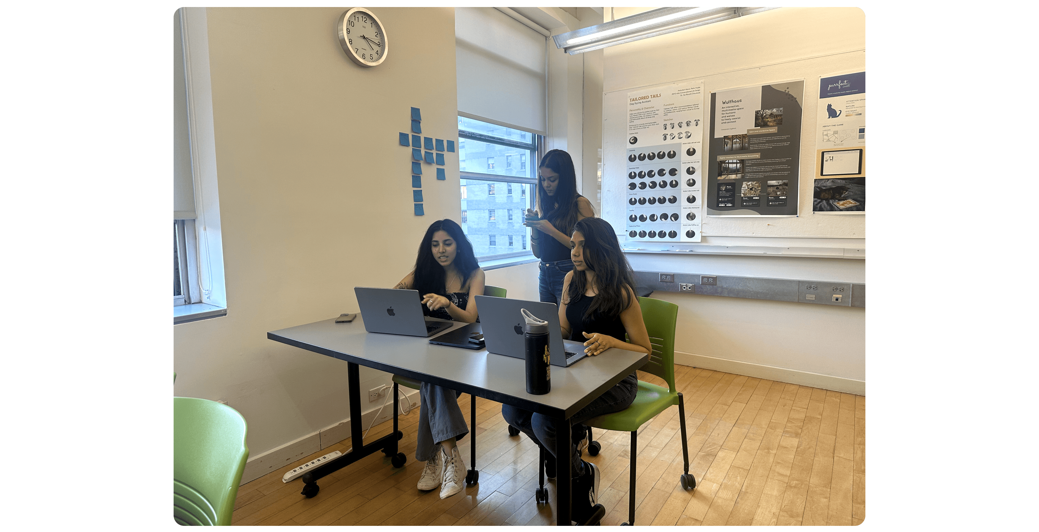
Sakshi S (me), Jimin, Kiyo, Nidhi

WHAT IS HERTZ?

WHAT IS HERTZ?

WHAT IS HERTZ?

Hertz is a platform for booking rentals, managing reservations, and accessing services like car sales and loyalty programs

Hertz offers a range of services including vehicle reservations for cars, vans, trucks, as well as specialised collections like electric vehicles (EVs) and luxury cars. Beyond rentals, Hertz.com provides access to additional services like car sales, loyalty programs (e.g., Hertz Gold Plus Rewards), and business solutions for corporate and government clients

PROBLEM DEFINITION

PROBLEM DEFINITION

PROBLEM DEFINITION

Hertz is scaling fast: multiple sites, multiple design directions; and so are its digital inconsistencies.

PRODUCT AUDIT

PRODUCT AUDIT

PRODUCT AUDIT

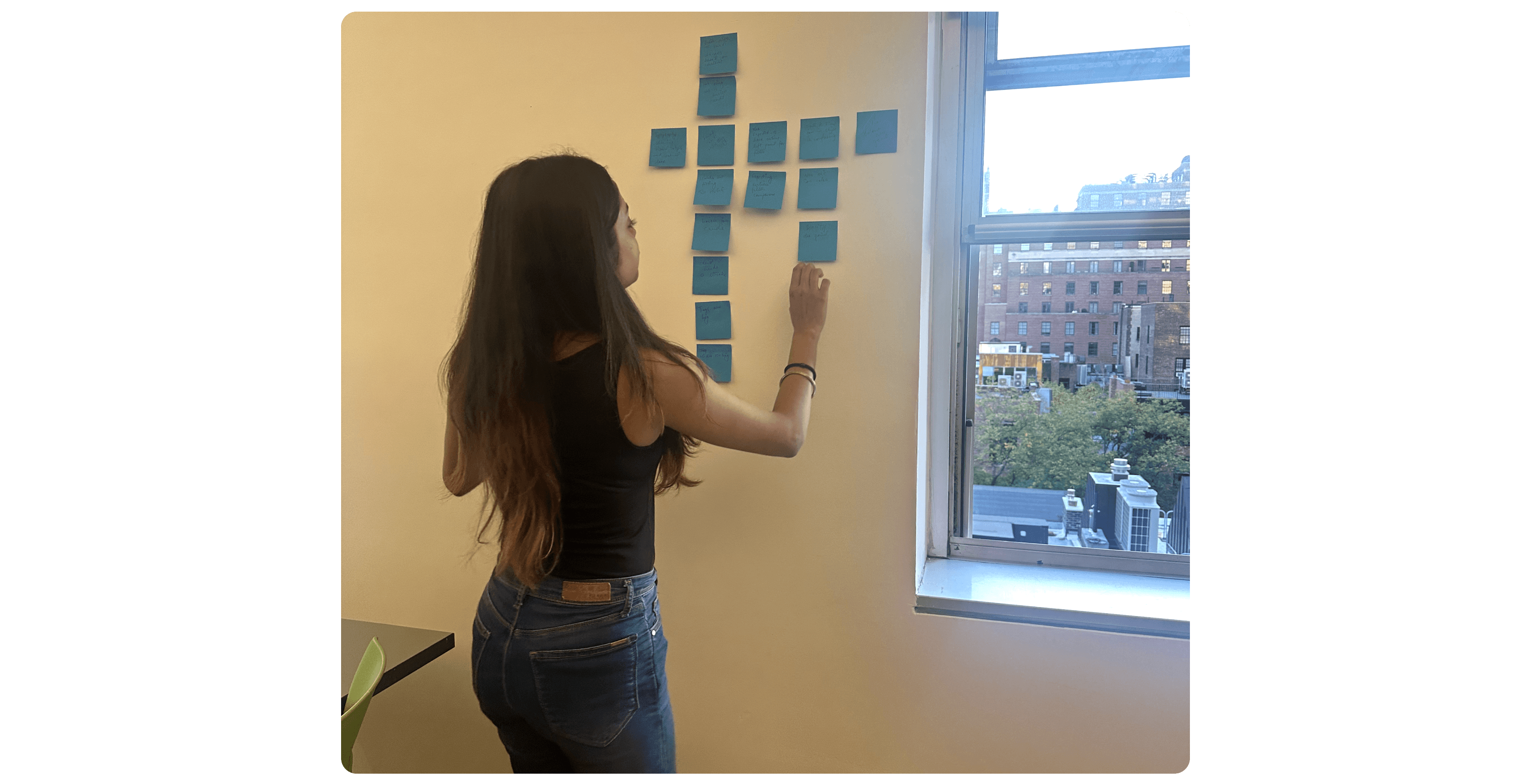
Before we started building, we needed to really understand what we were fixing. So my team and I ran a design audit.

14+ button variations with differing styles and text formats

‼️ Some had padding, some were bold. We had at least 6 styles claiming to be “primary.”

14+ button variations with differing styles and text formats

‼️ Some had padding, some were bold. We had at least 6 styles claiming to be “primary.”

12 distinct heading styles in typography, creating a fragmented visual hierarchy.

‼️ These ranged from 12px to 50px

12 distinct heading styles in typography, creating a fragmented visual hierarchy.

‼️ These ranged from 12px to 50px

3 types of social media icon links, each with a different design treatment.

‼️ Different weights, mismatched sizes, and clashing styles, from outlined to filled.

3 types of social media icon links, each with a different design treatment.

‼️ Different weights, mismatched sizes, and clashing styles, from outlined to filled.

It was like every team brought their own toolbox and none of them matched.

CHALLENGE

CHALLENGE

CHALLENGE

How might we build a unified design system for Hertz’s digital platforms that enables consistency, structure, and scalability across all platforms?

SOLUTION

SOLUTION

SOLUTION

Building Ignition Design System with reusable components, clear guidelines, and consistent branding, ensuring seamless user experiences and efficient collaboration across all Hertz platforms.

Building Ignition Design System with reusable components, clear guidelines, and consistent branding, ensuring seamless user experiences and efficient collaboration across all Hertz platforms.

Building Ignition Design System with reusable components, clear guidelines, and consistent branding, ensuring seamless user experiences and efficient collaboration across all Hertz platforms.

Figma Toolkit and ZeroHeight Documentation

BUILDING THE SYSTEM

BUILDING THE SYSTEM

BUILDING THE SYSTEM

Once we mapped the chaos, we got to create clarity. We broke the system down into 3 foundational layers

Once we mapped the chaos, we got to create clarity. We broke the system down into 3 foundational layers

Once we mapped the chaos, we got to create clarity. We broke the system down into 3 foundational layers

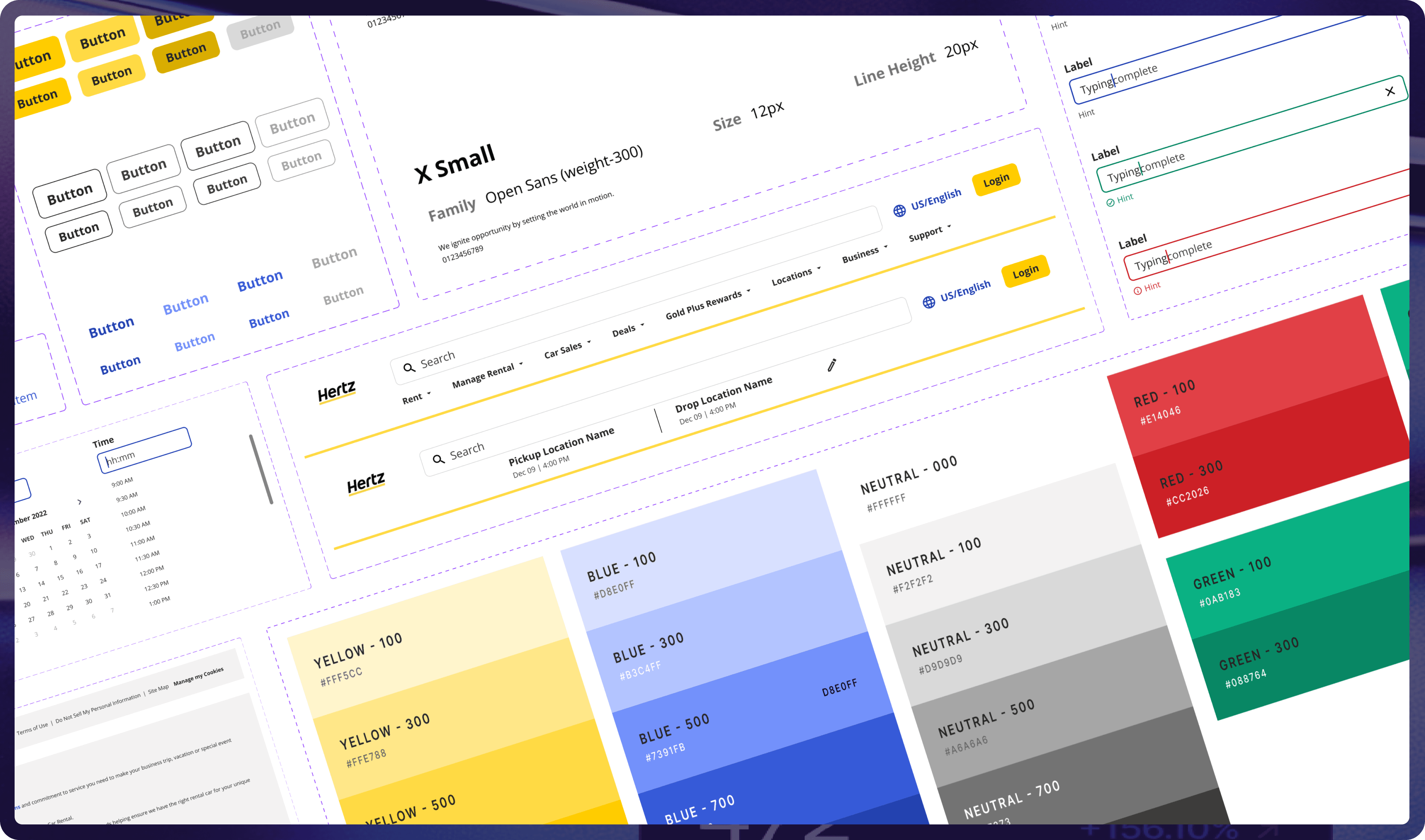
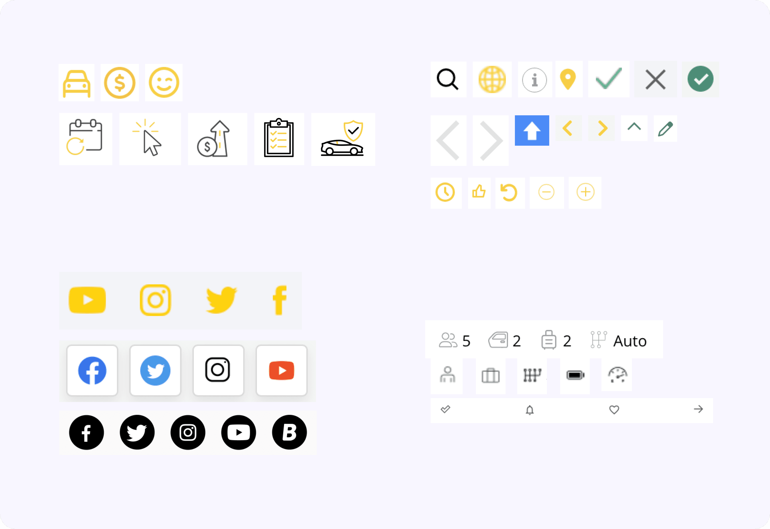
1. Foundations (The Nuts & Bolts)

We started small. Setting standards for:
Typography Scales
Spacing Systems
Color Tokens
Grid + Layout Rules

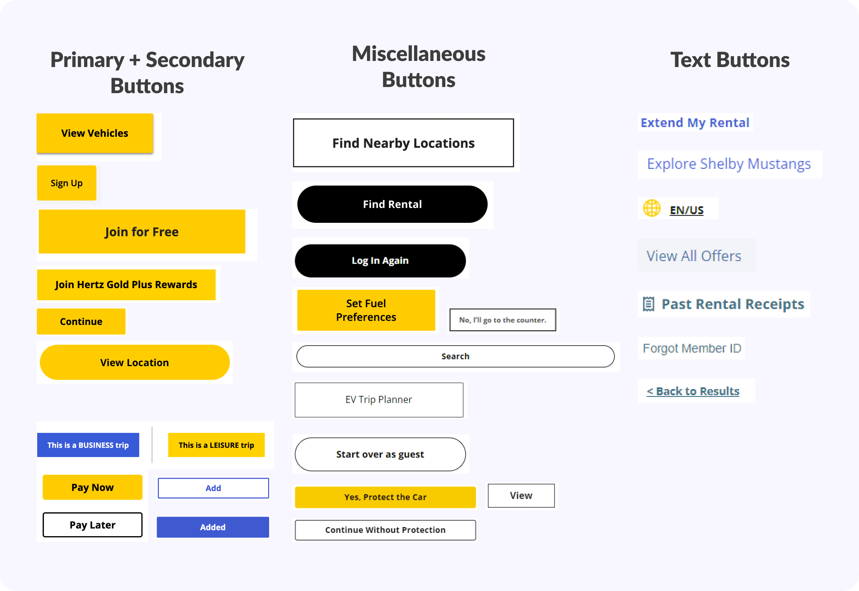
2. Components (The Gears & Levers)

From buttons to banners, inputs to dropdowns , each piece was built to be:
Reusable
Scalable
Consistent across breakpoints

3. Templates (The Engine & Dashboards)

We stitched components into flexible templates:
Filter Panel
Cards
Forms

USABILITY TESTING

USABILITY TESTING

USABILITY TESTING

After testing our UI kit with other designers, we made some adjustments to the grid structure and component sizing. We also added components that were found to be missing during the testing phase.

After testing our UI kit with other designers, we made some adjustments to the grid structure and component sizing. We also added components that were found to be missing during the testing phase.

After testing our UI kit with other designers, we made some adjustments to the grid structure and component sizing. We also added components that were found to be missing during the testing phase.

DOCUMENTATION

DOCUMENTATION

DOCUMENTATION

We documented comprehensive and streamlined guidelines to use our system

Our Zeroheight documentation hub is the core of our design ecosystem, detailing design principles, accessibility standards, best practices, and component guidelines. It includes a governance policy that offers clear instructions for contributing and accessing system support.

Our Zeroheight documentation hub is the core of our design ecosystem, detailing design principles, accessibility standards, best practices, and component guidelines.

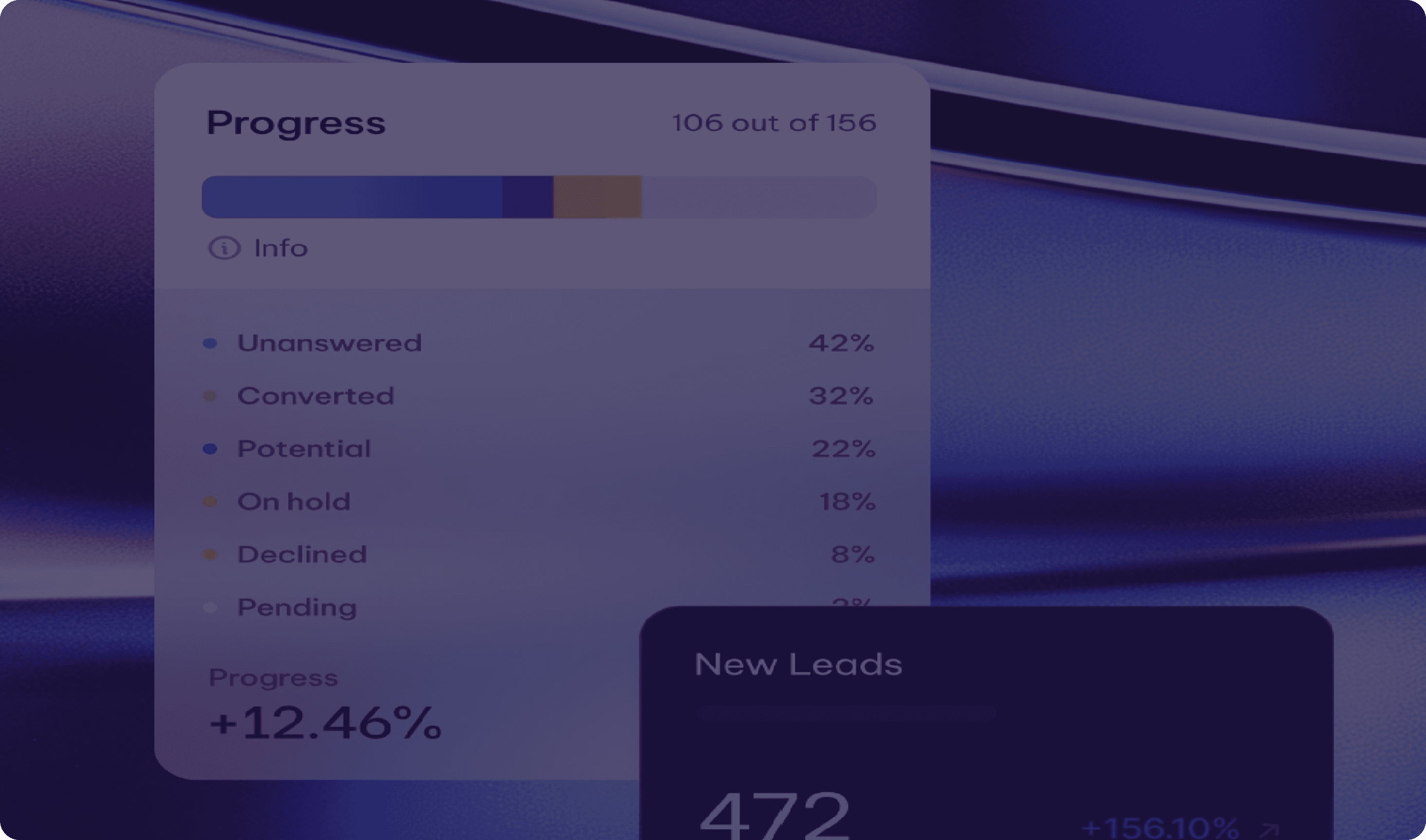
ZeroHeight Documentation Snip-its

OUTCOME

OUTCOME

OUTCOME

The redesign elevated the interface, creating a seamless and intuitive experience that strengthens the Hertz brand identity.

Before

After

Before

After

Before

After

PITCH DECK

PITCH DECK

PITCH DECK

We created and presented a pitch deck to showcase the need for the design system and secure buy-in for adoption across Hertz’s digital platforms.

LEARNINGS & TAKEAWAYS

LEARNINGS & TAKEAWAYS

LEARNINGS & TAKEAWAYS

How this project helped me grow as a designer?

01

Token structure evolves

Defining a token structure upfront didn’t fully work for us. We discovered that the ideal hierarchy and structure developed naturally as we worked through the process.

02

Overcommunicate

Despite strong collaboration, design gaps surfaced during testing, showing that overcommunicating helps catch overlooked details.

Despite strong collaboration, design gaps surfaced during testing, showing that overcommunicating helps catch overlooked details.

©2025 Sakshi Sonawani 🤍

©2025 Sakshi Sonawani 🤍

©2025 Sakshi Sonawani 🤍